Themes
A Salt theme is a collection of defined visual styles that shape the overall look-and-feel of a digital product. This encompasses elements like color, typography, spacing, and corner radius, ensuring a consistent and cohesive appearance throughout the product.
A theme in Salt enables delivery teams to streamline the process of creating a consistent design language across their business domain, platforms or products.
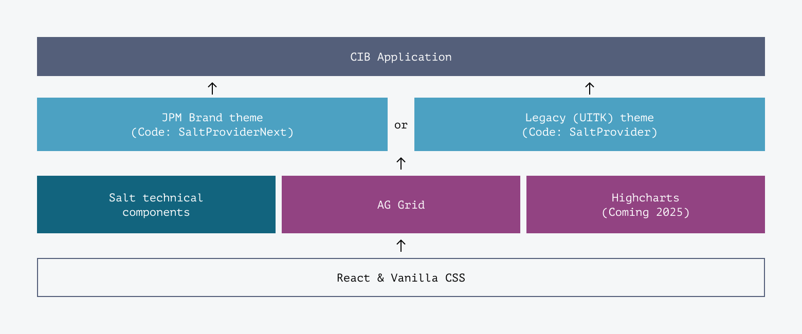
Salt uses themes to style its technical components and recommended libraries (such as AG Grid and Highcharts). Keeping styles separate to components makes it easy to switch between themes, without breaking or altering the underlying application build.
Salt styles its components and patterns using design tokens. A design token is a text reference (or alias) for a specific value (px, %, pt, #, etc) which is used to style a component attribute (border color, border thickness, fill color, etc).
Salt themes are defined by design tokens that are organized into 3 levels:
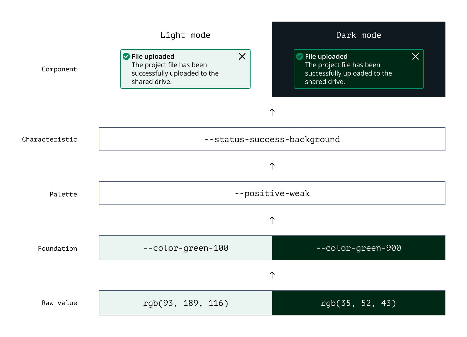
Foundation tokens are the base level of the theme. They reference the raw values that underpin the design system. For instance, a color such as --green-100 references rgb(93, 189, 116) and --green-900 references rgb(35, 52, 43).
These tokens can be used directly to define spacing and size of components and patterns.
Palette tokens are a subset of the most frequently used Foundation tokens, and are referenced by Characteristics tokens.
A palette token can reference more than one foundational token–this capability enables components to toggle between ‘modes’ (e.g., light or dark). For example, the palette token --palette-positive-weak is --color-green-100 in light mode or --color-green-900 in dark mode.
The palette level is the simplest point to define or modify a theme. Changing one token here can impact many characteristic tokens (and therefore components).
Never use a palette token to style components and patterns directly.
A ‘Characteristic’ is a group of tokens that share the same purpose (or semantic). For example, the Status characteristic groups any tokens used to style error, warning or success component states.
Characteristic tokens reference palette tokens. For instance, the characteristic token --salt-status-success-background references the palette token --salt-palette-positive-weak.
These tokens can be used directly to color your components and patterns.
Banner gets its background color from the Status characteristic tokens.
Characteristic: --status-success-background
Palette: --positive-weak
Foundation: --color-green-100 (light mode) or --color-green-900 (dark mode)
To keep the number of design tokens in the Salt system manageable, Salt doesn't have tokens for every attribute of every component and every state.
Instead, Salt provides tokens that reflect the design intent of the system. For example, if all Container borders are 1px thick then Salt provides a single --size-border token which updates all borders. This means we can maintain the cohesive systematic nature of the system as well as the quality of interaction design patterns and accessibility.
Salt has two themes:
- JPM Brand theme
- Legacy UITK theme
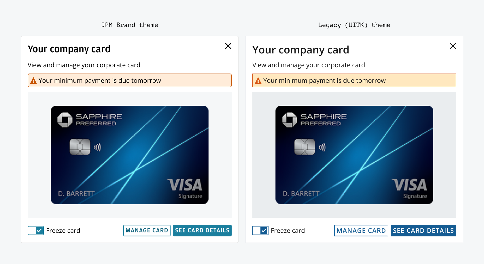
We understand that application migration journeys from the UITK system will vary in time and complexity. To enable phased migration of more complex applications, Salt can be used with its Legacy (UITK) theme together with UITK components.
J.P. Morgan employees can read more about migration journeys and comparisons between the two systems.
The JPM Brand theme (previously the Salt Next theme) brings the JPM Brand identity to CIB (Commercial & Investment Bank) digital applications and is the long-term visual identity of the Salt system.
Working with Corporate Brand, CIB Marketing and LOB delivery teams, the Salt design system has adopted key styles to ensure visual alignment to the JPM Brand. Although not an exact match, these changes have been approved by both parties to address the complexities of desktop and web applications across the CIB. This brand theme will continue to evolve and grow as core requirements are fed back into the Salt system.
Due to the benefits of improved accessibility and brand alignment, Salt recommends that delivery teams plan to switch to the JPM Brand theme. If you’re a J.P. Morgan employee you can read more about the JPM Brand theme and if you should use it.
Supports light and dark modes across four densities, with teal serving as the primary accent color across the system–reflecting the JPM brand.

The foundational color palette has been refreshed with updated shades of the same general colors found in UITK (gray, blue, teal, purple, red, orange, and green). These new colors are derived from the hue and saturation values in the JPM MasterBrand Styleguide.
The updated palette creates a lighter and brighter look suitable for both institutional and consumer experiences.
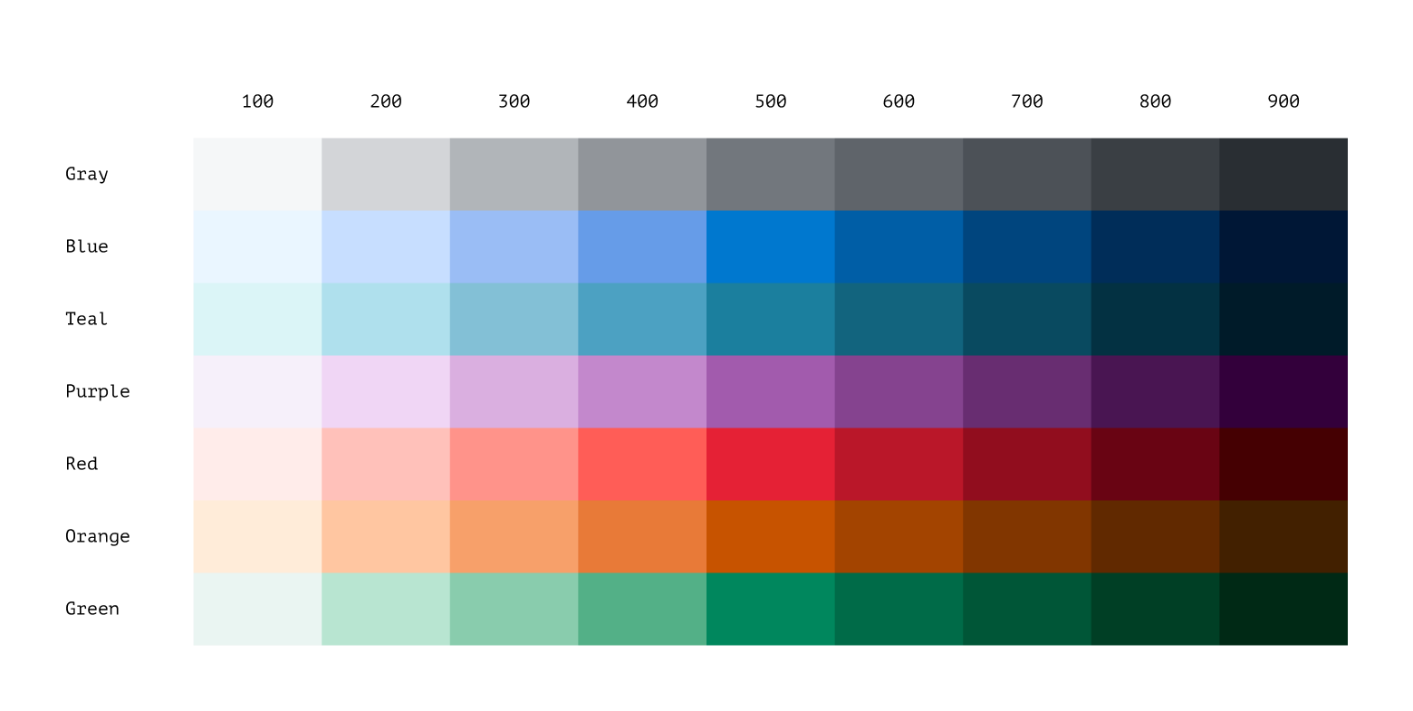
To address the many unused colors in the previous palette, the new color ramps have been reduced to nine swatches per ramp, with 500 as the shared middle value. We call this mode agnostic, meaning the color remains the same when switching between light and dark modes. The rest of the palette is based on 'equivalents,' where the ramp is inverted for dark mode—for example, blue-100 in light mode is equivalent to blue-900 in dark mode and vice versa.

The 500 series swatches have been carefully selected to ensure that primary text—white or black—achieves a minimum contrast ratio of 4.5:1 when placed on any of them. These swatches serve as the base color value for each ramp, with four lighter and four darker swatches on either side.

Primary, secondary, and tertiary backgrounds have been created as standalone swatches and are no longer tied to the color ramps. This includes snow, marble and limestone for light mode; and jet, granite and leather for dark mode.

A revamped categorical color palette has been added, expanding from 20 to 40 color options per mode. Colors 1 to 20 are mode agnostic (for use in both light and dark mode), following the same principle as the 500 series in the foundational palette, ensuring primary text (white or black) meets a minimum contrast ratio of 4.5:1 when placed on any of these colors.

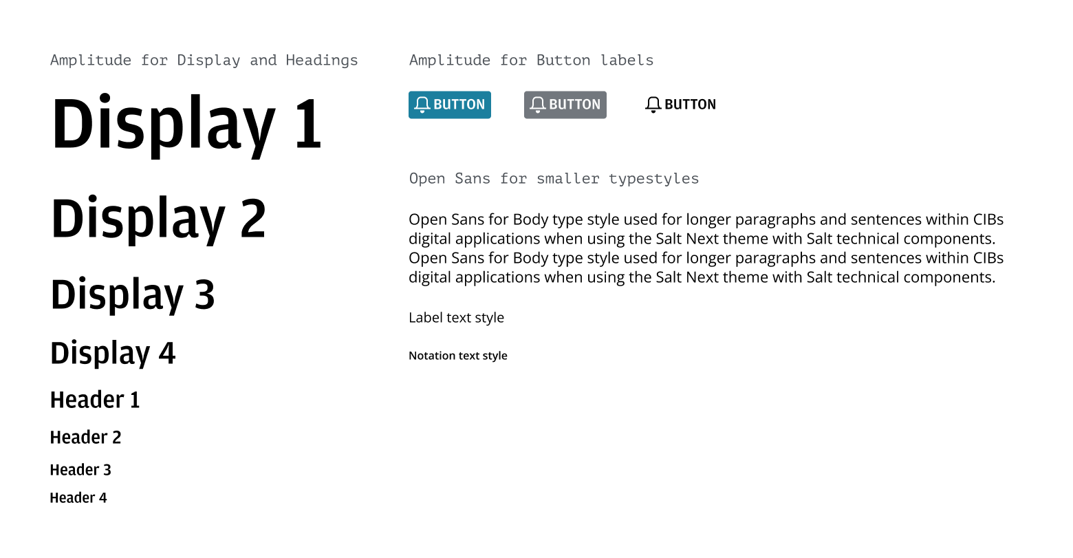
The JPM Brand theme introduces the Amplitude typeface, taken directly from the CIB Brand Guidelines, for use in header and display sizes as well as button labels. Open Sans remains the primary typeface for body copy and smaller type.
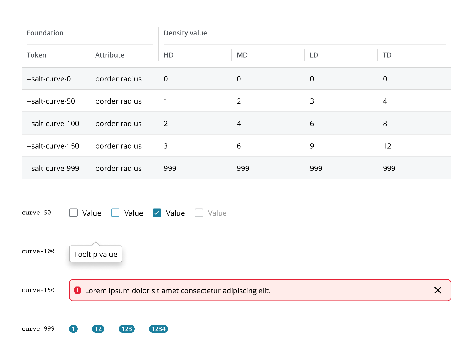
Corner radii have been systematically defined for specific components. Each density includes four different radii, which help achieve a sense of complementary visual nesting when used together.
As of 2025, Salt provides a single Figma component and pattern library which supports both themes. This new library uses Figma variables to enable a choice of:
- Mode: Light, Dark
- Density: High, Medium, Low, Touch
- Theme: JPM Brand, Legacy (UITK)
The Salt libraries you need to install into your projects are:
- Salt DS Components and Patterns
- Salt DS Themes
- Salt DS Assets
Optional
- Salt DS Legacy (UITK) Colors
- Salt DS JPM Brand Colors
- Salt DS JPMC Logo
If you are a J.P. Morgan employee, you can read more about the new libraries and how to start using them.
To install the libraries:
- Go to the Assets panel in your Figma file.
- Tap on the Libraries icon (open book icon).
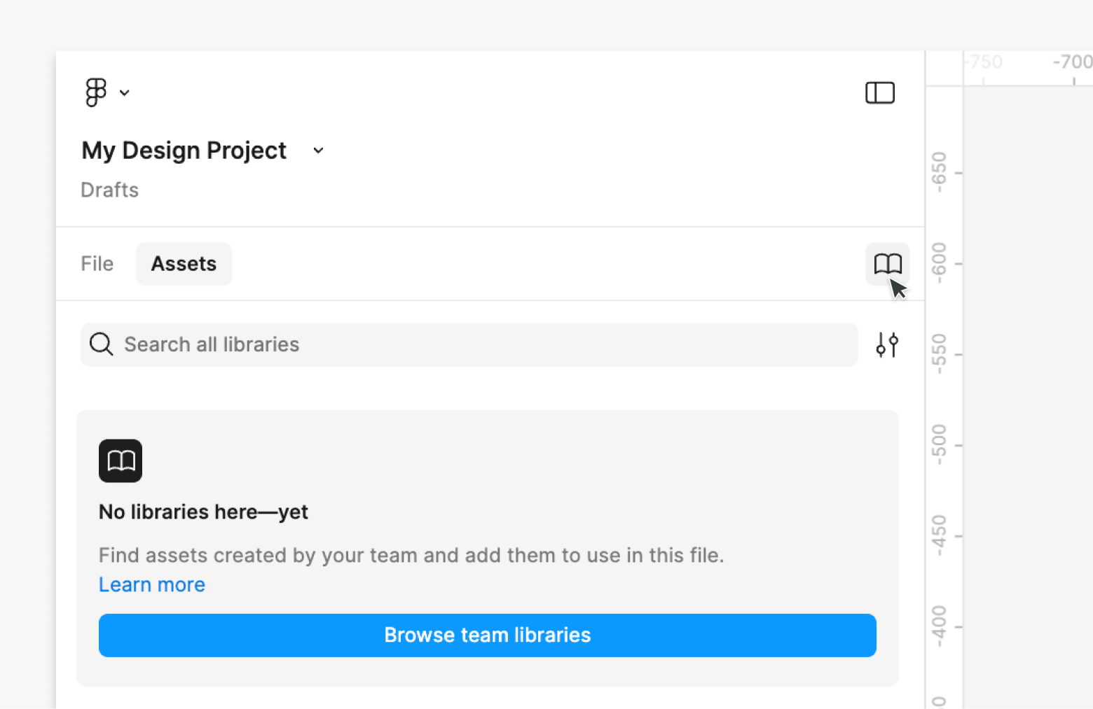
- Search for 'Salt DS’.
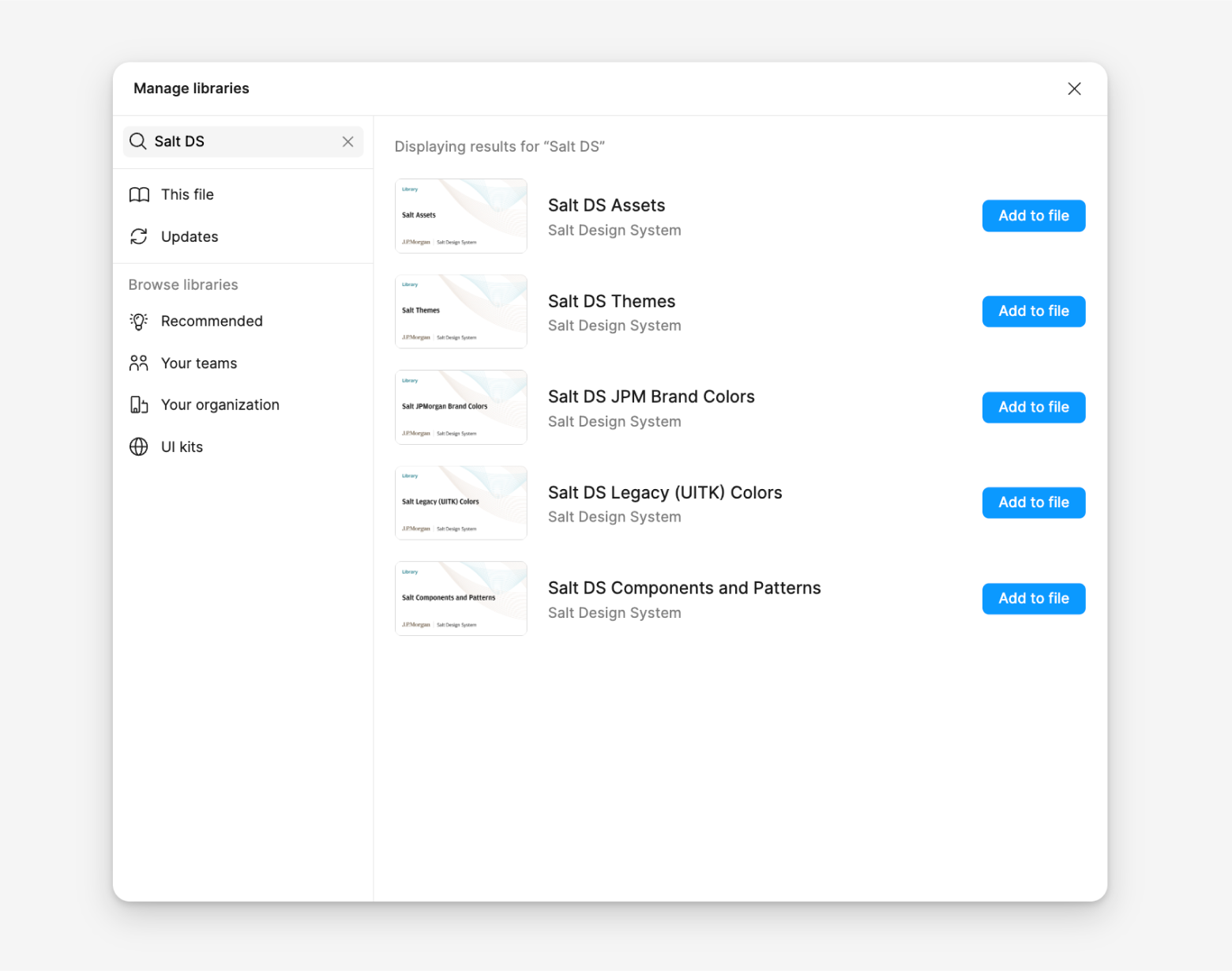
- Add the libraries referenced above to your file.
The Themes library includes all the Figma variables needed to style with Salt. It includes the semantic palette, category colors, size and spacing values, corner radii, typographic styles and more.
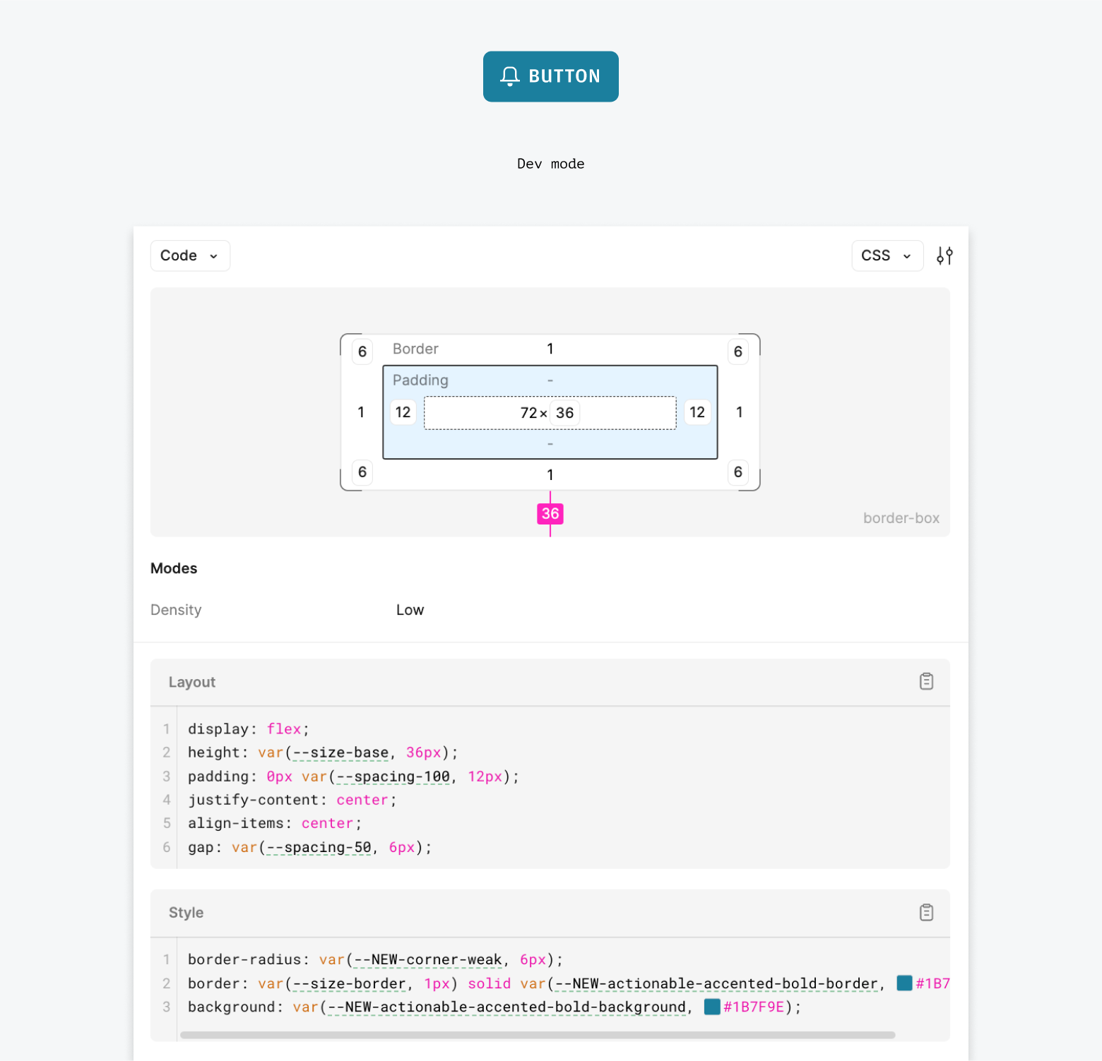
The variables are set up to match our tokens in code. When inspecting a design in Figma's Dev Mode, you can see references that match our tokens, such as size and spacing values (e.g., --spacing-100 in Figma maps to--salt-spacing-100 in code).
Note: In code, all tokens are prefixed with ‘--salt-’, e.g., --salt-spacing-100.
The Colors libraries provides access to all foundational color ramps (e.g., --blue-100 to --blue-900) for Legacy (UITK) and JPM Brand themes. These colors are linked to the semantic styles in the Salt DS Themes library.
You don't need to add these colors to your project unless you want to use them directly. For consistency across components, Salt recommends only applying variables from the Salt Themes library to your project.
- Add components: Drag from the Assets panel.
- In the right sidebar, click ‘Apply variable mode' (swatch icon) button in the Layer panel to see all available options.
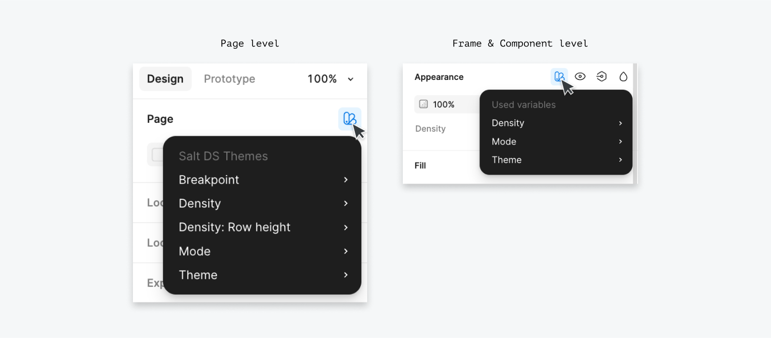
- For Pages, Groups, Sections, Frames or Components:
a. Mode: Light, Dark b. Density: High, Medium, Low, Touch c. Theme: Legacy (UITK), JPM Brand
You can define themes in code using the following components:
- SaltProvider component provides the UITK (Legacy) theme
- SaltProviderNext component provides the JPM Brand theme
SaltProviderNext adds .salt-theme-next to the root or provider element, along with any needed data attributes (e.g., data-corner). All values in theme-next.css are scoped to .salt-theme-next to override any existing values.
To display components in the JPM Brand theme, you currently need to configure the styling option props of SaltProviderNext. You will need to configure the following attributes.
When Amplitude is used, default heading font weight is set to medium (instead of semi bold for Open Sans), via --salt-palette-text-heading-fontWeight and --salt-palette-text-display-fontWeight variables.
To ensure that every user sees the Amplitude font correctly, you'll need to add it to your application, which can be downloaded from the fonts page on the internal site if you're part of JPMC.
The design token structure for the JPM Brand theme has been simplified and can be customized if required.
In code there are two ways to customize the theme:
- System-wide 'styling options'
- Targeting design tokens
Note: If you choose to theme Salt its your responsibility to maintain and deliver that theme in code and Figma.
SaltProviderNext styling option props provide the capability to make specific adjusts to the design of Salt components across the system.
A theme recipe is a defined selection of styling options for your theme. You can use an npm package to ensure consistency. For example, a team can encapsulate preferred presets, allowing product teams to use them without needing detailed knowledge of the options.
If styling options alone don't achieve your desired visual design, you can create a new theme by changing the values of the Foundation, Palette or Characteristic tokens. This requires a deep understanding of the system, and significant design effort and increased cost. Possible use-cases for theming include:
- Differentiating products while maintaining alignment with J.P. Morgan, e.g. unique accent bar colors for each product in a platform.
- Aligning with an alternate design system to support migration to Salt.
- Achieving greater parity with a brand other than J.P. Morgan, such as Chase.
For example, you may choose to use a custom primary color in your app. Here the blue is replaced by a custom magenta (and checked to ensure 4.5:1 color contrast).

Any theme changes mean you assume certain responsibilities from Salt. For example, if you change a token for a background color, you must ensure it meets accessibility standards for contrast ratios.
Most design tokens are used across multiple components, so you need to understand the impact and test changes thoroughly across the product. In Figma, create and publish custom components independently of the provided Salt libraries. In code, create a centralized CSS stylesheet with the changes to be imported alongside the Salt theme.
By modifying the theme, you own the cost of the change and are responsible for maintaining it.
We do not recommend customising the look-and-feel of the current theme. The design token structure has not been optimized for theming. Any customizations made to this theme are your responsibility to maintain.
White labelling allows the design system to be fully customized. It means you can take the base code and make it look completely different. It enables external companies to follow their own brand guidelines or mimic an alternate design system as closely as possible without having to build a design system from scratch.
In code, each component would need to be wrapped and published as a new component, and from a design perspective a new set of libraries would need to be created and maintained.
White labelling requires significant changes and investment, and therefore is not supported by the Salt team.